Most government and nonprofit websites get built by describing the specifications and design, getting someone to build it and then after internal review, launch! That can work, but it often produces sites (and apps) that don’t really meet the specific needs of your audience, your users, your stakeholders. Despite this being how we do things in this sector, there are better practices out there; one of the better things to come from Silicon Valley is the field of User Experience or user testing- something intimidating at first but something very much within reach of any organization or agency. Let me tell you about how we’ve started using this practice- I’m not an expert but I’ve had the privilege of working with some through OpenOakland and now we’re putting this to the test at Urban Strategies Council.
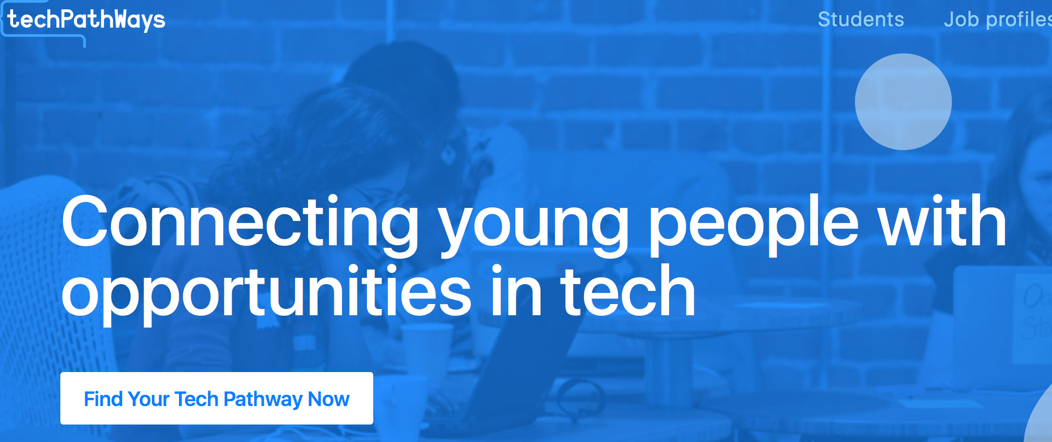
techPathways.org is a new website that’s being created in partnership with a bunch of great orgs in the East Bay- it’s bootstrapped (done on the cheap) and not yet officially launched, but it exists, so don’t consider it a secret. We had the idea formed by many stakeholders, a great design shop pro-bono’d the look and feel (Raizlabs) and another small firm built it (dStrategies). We have a fantastic marketing strategist helping put together our plan to promote and sustain the site too (thanks Carrie). What was missing in all of this expertise and thinking was the users- the people we’re really building this to help. We want to demystify tech jobs for young people of color in the east bay- to change both the technology career pipeline itself and to encourage local youth to get into jobs that pay well enough to help them stay in Oakland and the East Bay. Clearly we needed to hear directly from some of those young people about how techPathways.org could work best for them.
User Experience testing requires one hard thing- a willingness to hear from others how bad your product may be. Listening is critical, but if you’re not open to hearing a bad message, you won’t do this right.
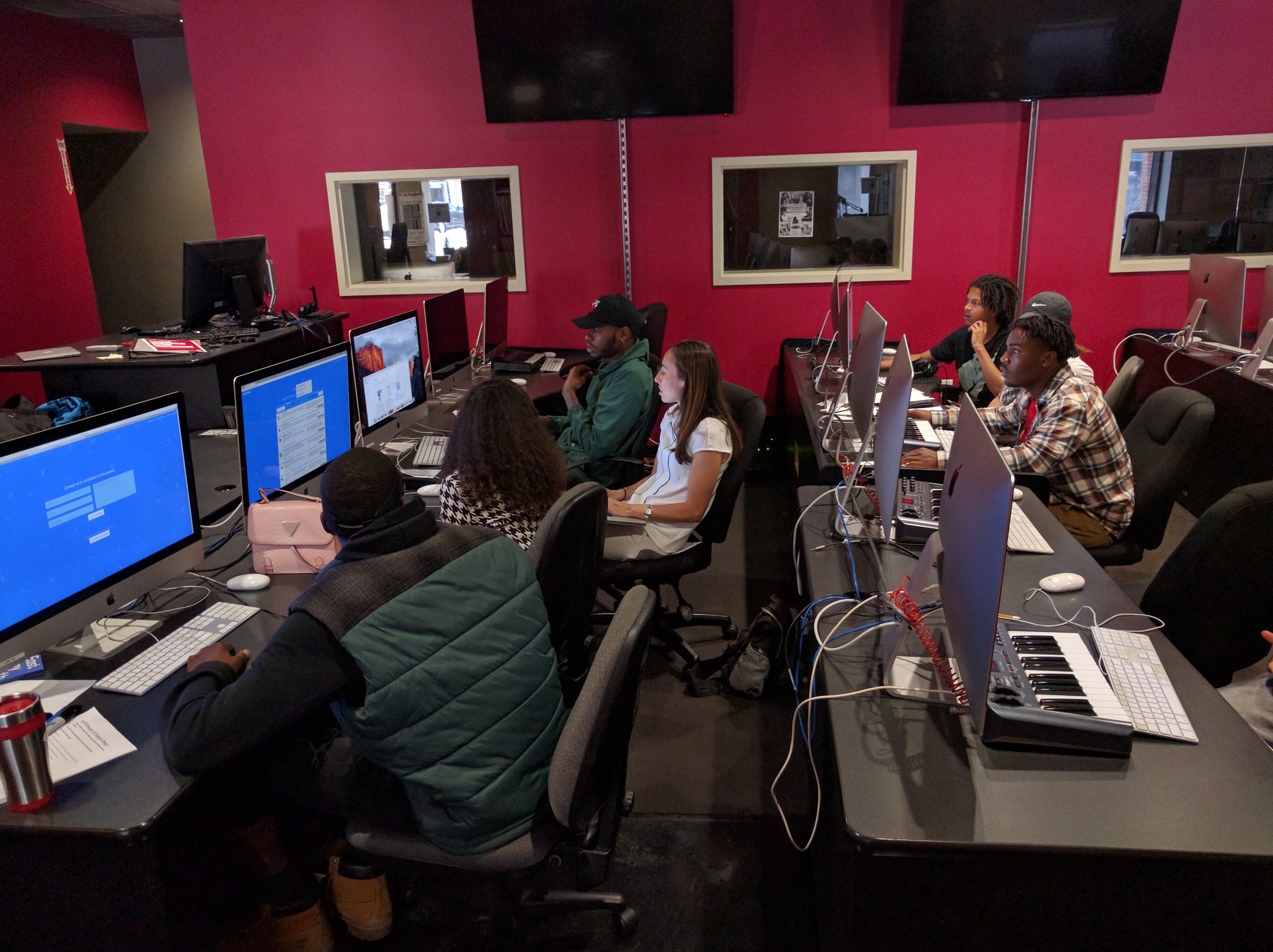
We conducted our first UX session in partnership with Youth Radio, just across the street. They gathered six young people from one of their programs and our team planned out a session that would do these things:
- Gather feedback on the interface design- do young people find their way around the site as planned?
- Refine language on the site- is our wonk-level language use ok, or are we confusing users?
- Validating or refuting our ideas on what information young people want when seeking training opportunities.
We adapted some questions from a session I’ve helped run before and then got to work with our group. Our session was 50 minutes long and had four main segments:
- General questions about how they find jobs and training currently- and what they imagine they would want from a website like this;
- Watching them try out the site individually to assess how they navigate it, followed by general feedback as a group;
- Showing the group some planned new features using a paper prototype, to get their feedback; and
- An exercise to draw up their career pathway- on paper.
From this session we learned many important things- almost all of them easy/cheap to fix. Imagine that- launching a website knowing that many things have been already validated or improved by your users! Some UX sessions will have you throwing your head to the desk as your assumptions were wrong, or the design just wrong, but it’s such a valuable gain that I can’t imagine doing any projects on the web without doing this each time. We learned that many pieces of language were not clear- that buttons needed renaming, menus rearranged and renamed, contact forms made more prominent, linkages changing and also that they really dug the design and build of the site.
We also learned much about how to get this site used by young people- and our plan to focus on Instagram and SnapChat for promotion was altered when we heard they found out about programs from their moms a lot- so we can re-add Facebook to our list- if that’s where adults are, we can reach them there, and thereby reach their kids too. Small things.
We’ve got one more session planned with another youth development partner Soulciety. Then we’ll be launching for real. My guess is that this approach added about:
- Three hours to arrange the sessions;
- Four hours to plan them;
- One hour each to execute;
- One hour to review changes.
So when you’re building a digital tool or website- think about the value of testing your product with an audience early on- ten hours can give you critical feedback and let you adjust a product to really meet the needs of your users better. And maybe avoid some embarrassment.
Special thanks to Andrea Moed for her feedback on this post, but more importantly for teaching me so much in partnership at OpenOakland- I may have helped create this space but each one teach one is how it really works in community.
